We’ve said it before – sustainable businesses don’t necessarily need a leaf in their logo!
We all have a product in mind when we think back to the first “green” products to hit supermarket shelves. Cleaners, detergents, bags and toiletries continue to indicate their friendliness to us with brown craft paper packaging to signify their ‘naturalness’, varying shades of green labels and large recycling iconography.
But do consumers really become loyal to these brands? Are these products building green brand equity, or are they simply creating a retail parody problem?
Consumers pick up on these cues because they’re hoping for much more than a green experience – they’re hoping to be left with the feel-good sense that they’ve made a positive choice for the planet. But with more and more products rushing to leverage the same tactics, there’s a chance the truly green offerings, products and brands are being drowned out by mediocre ones simply copying their look and feel.
This “first-wave” green branding and packaging – the craft paper, green tones, flat recycling iconography – has ultimately become overwhelming, making it difficult for consumers to relate to their value propositions, or make choices reflecting their expectations.
With a look and feel so ubiquitous across all product categories, consumers have a hard time finding what they’re really looking for – sometimes, they can’t even tell what they’re buying. Companies who reproduce this approach with “me-too” branding, turn all their fonts green and simply increasing the price. This damages true sustainable credibility and leaves customers asking if their “green” choice is actually better than the item next to it on the shelf.
How will your audience know which product is the one with the great “green” experience, leading to reduced emissions and a healthier planet and which one is the imposter jumping on a fad?
The R&G design team believes greenwashing your brand or product design no longer cuts it.
With sustainable packaging now considered ‘mainstream’ according to The Dieline, how will your package designs stand out?
Ditch the brown craft paper, and rethink the green.
Here are our top 3 design tips to gain brand loyalists for your sustainable product that don’t involve greenwashing.
1. Keep Your Language Simple
Use language consumers will understand. Don’t scare them with unknown terminology, pseudo-science or overwhelming info.
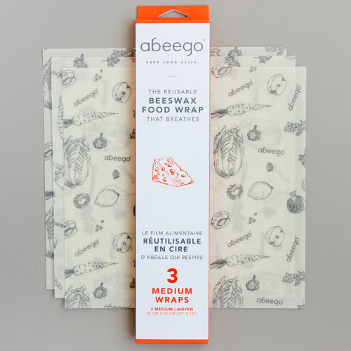
Take Abeego, a reusable beeswax wrap hoping to replace plastic cling wrap and other fresh food storage options. With any net new product requiring new behaviour, the goal should be simple education. With as few words as possible, Abeego lets us know how its product is used and why it’s beneficial in keeping our food alive, sparing us the idea of our kitchen habits contributing a mound of plastic on trash island.
2. Radiate Positivity
Mitigating climate change is important to a lot of consumers. But the overwhelming amount of negative information about climate change can have the opposite effect from what’s intended, contributing to apathy rather than spurring audiences to action. How can you help your customer make positive change? It seems obvious, but you’d be surprised how often organizations have to be reminded that positivity is an important brand equity growth engine. Keep your brand feeling peppy and positive.
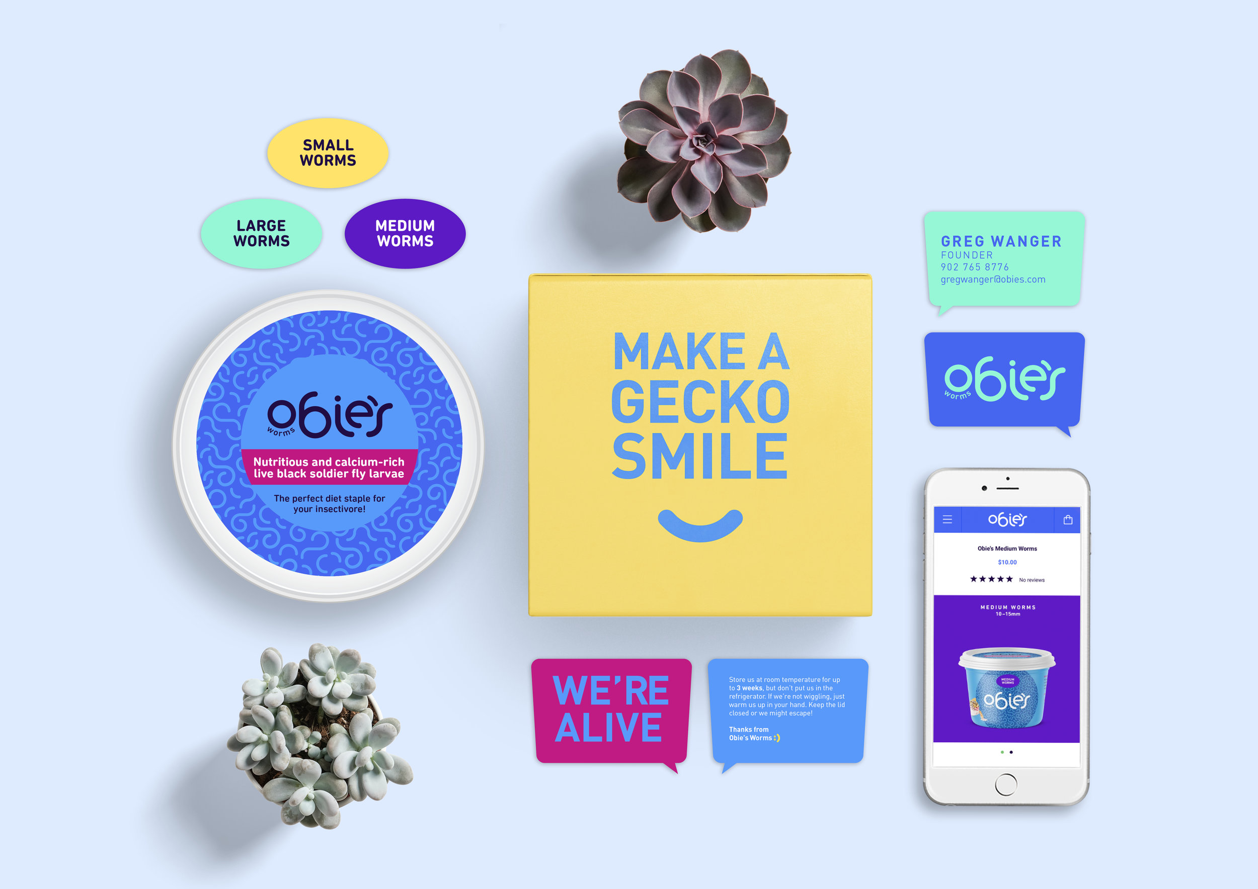
Obie’s Worms does this by incorporating their own company mascot – the team’s gecko, Obie – into the brand DNA. They also maintain the positivity through a mix of unexpected, vibrant colours and light-hearted messaging. It’s pretty easy to fall in love with this brand, especially when you learn that the company completely closes the carbon loop through sustainable pet food production.
3. The Details Matter
Once your consumer understands and can see why your product is superior, don’t forget the details. The extra thought, the surprise experience, the extra mile in your execution is where you get to bring your passion and vision to life (and show how much you really care about the planet).
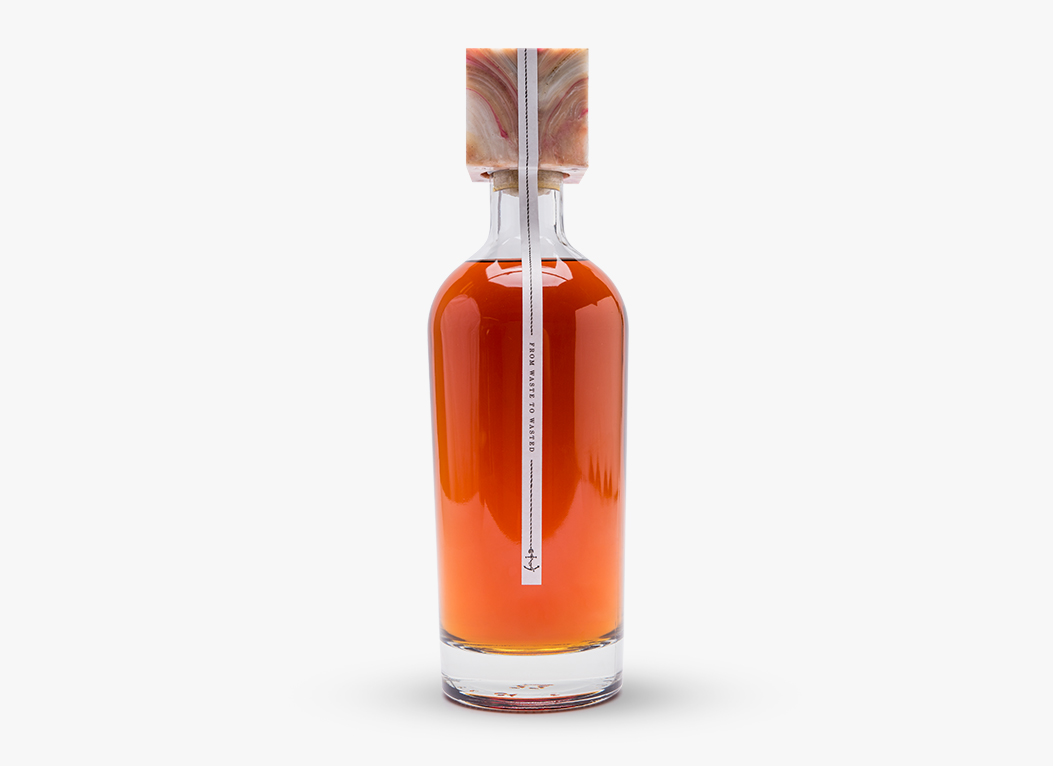
This sustainable rum designed using old Coca-Cola labels is a great example. The package is certainly cheeky and fun, but they take it further by making trash truly beautiful. It is also able to introduce a new perspective on reuse and renewables at the same time.
How can you take similar steps? At R&G we are 100% tree free, using only Sugar Sheet and Wheat Sheet paper when we absolutely need to print. The little things can go a long way.
